Presentation:
MUSEUM FOR BAROQUE ART IN MÉXICO (Puebla, México)
It opened on February 4, 2016.
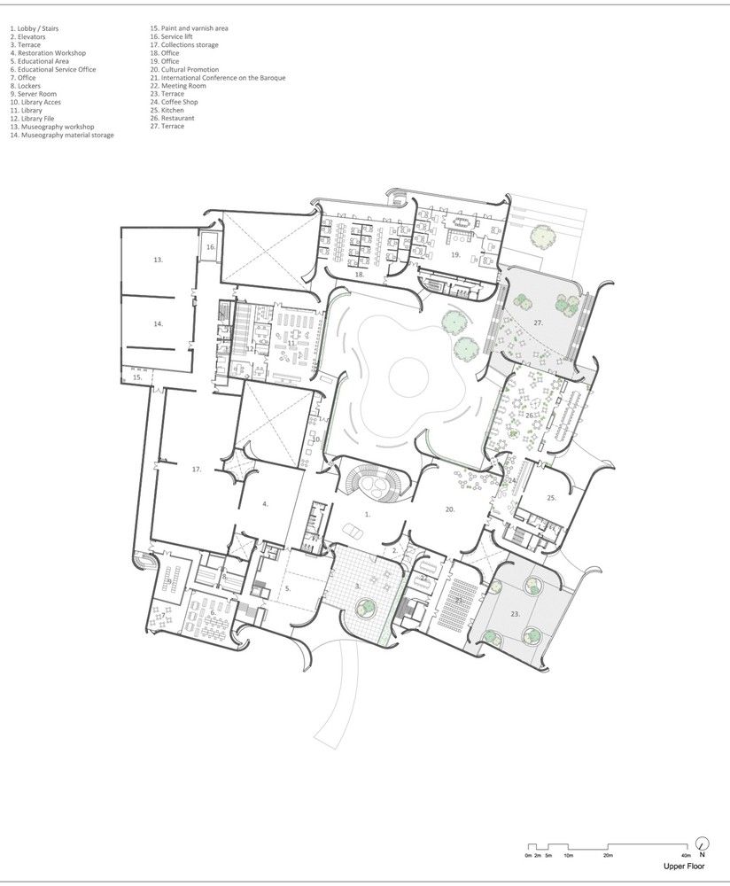
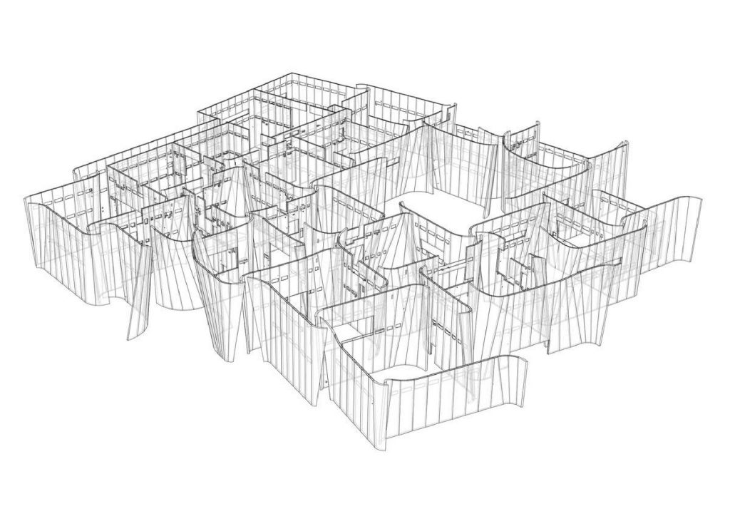
PLAN
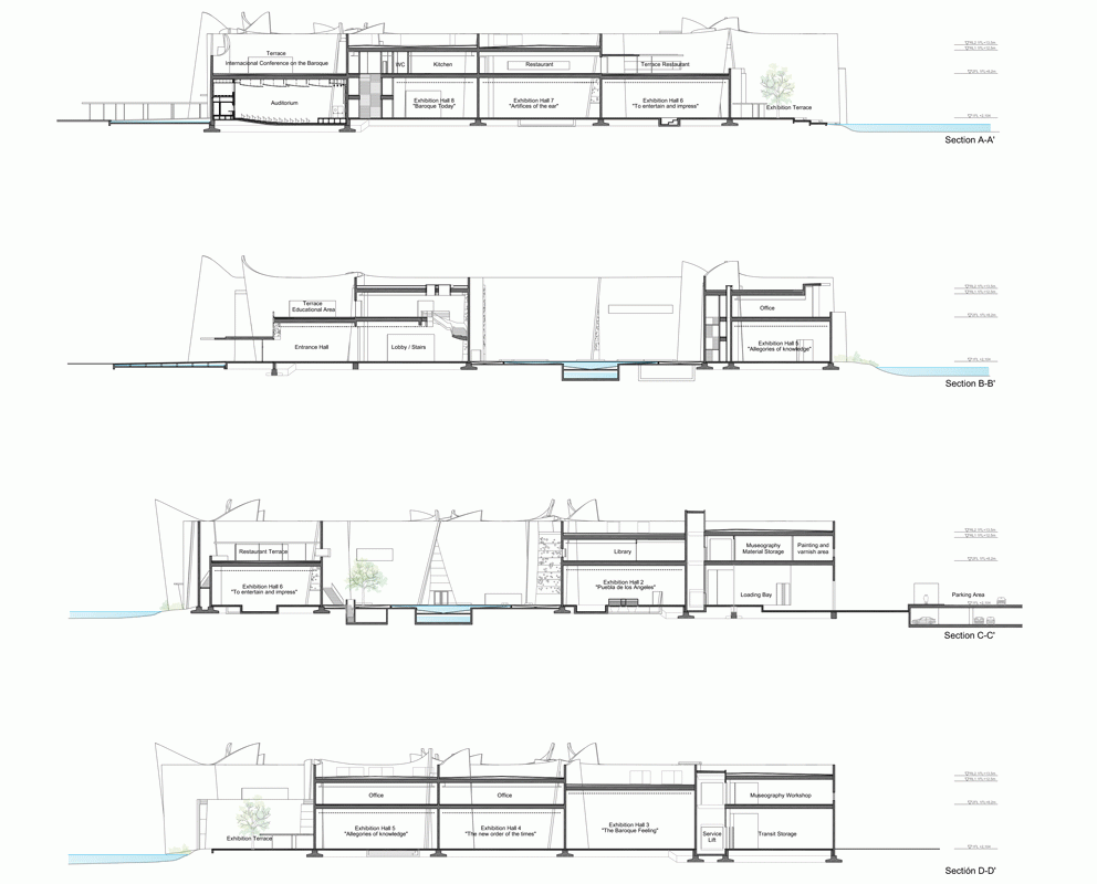
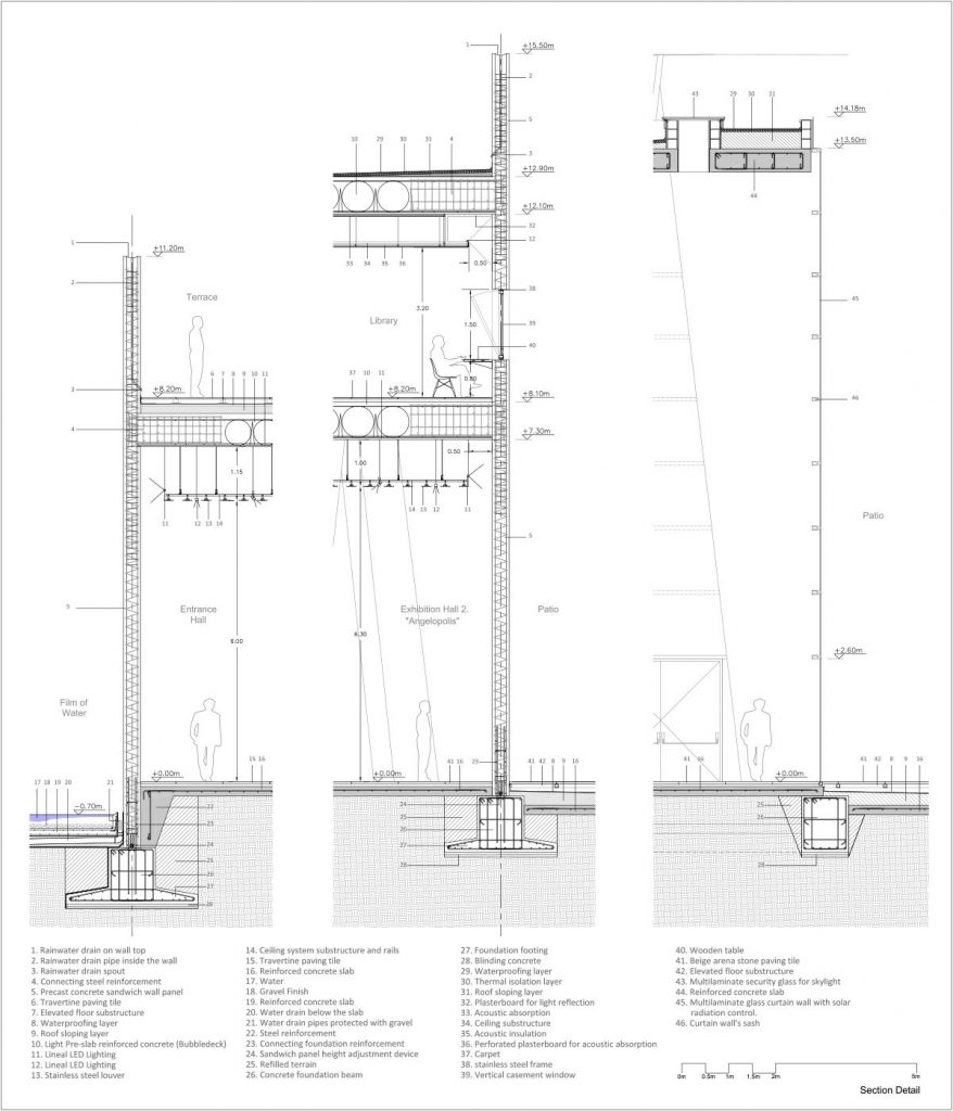
SECTIONS
The Analysis:
GRID
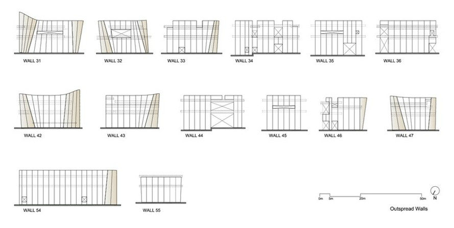
In designing the museum, Toyo Ito was inspired by a number of elements typical of Baroque art; from the strong relationship between artifice and nature, to the plan consisting of a grid of rectangular “cells” rotated and deformed.
MOVEMENT
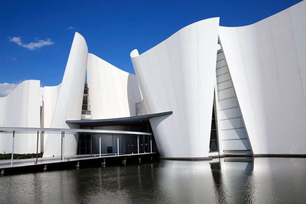
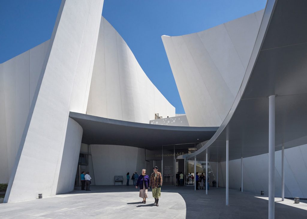
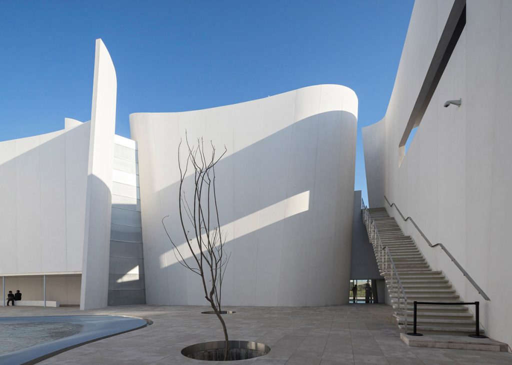
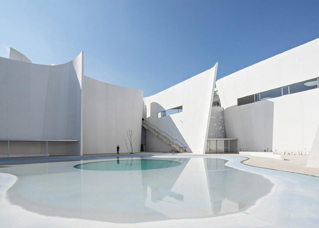
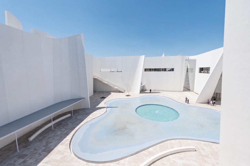
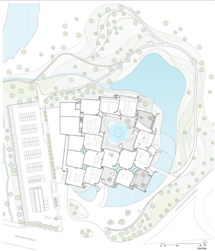
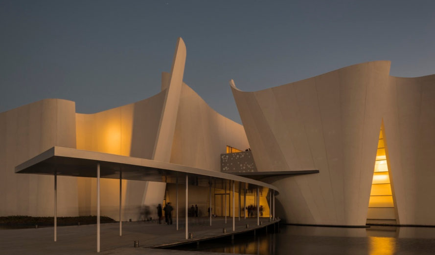
In order to achieve a sense of fluidity, the rigid layout was dissolved with a series of curving walls.
It inspires the idea of the movement of water. Moving water is a recurring theme of the Baroque era.
LIGHT
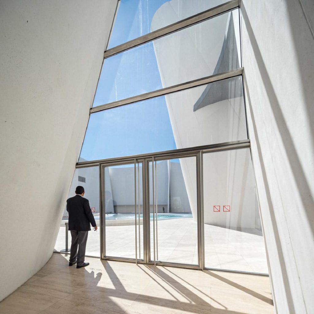
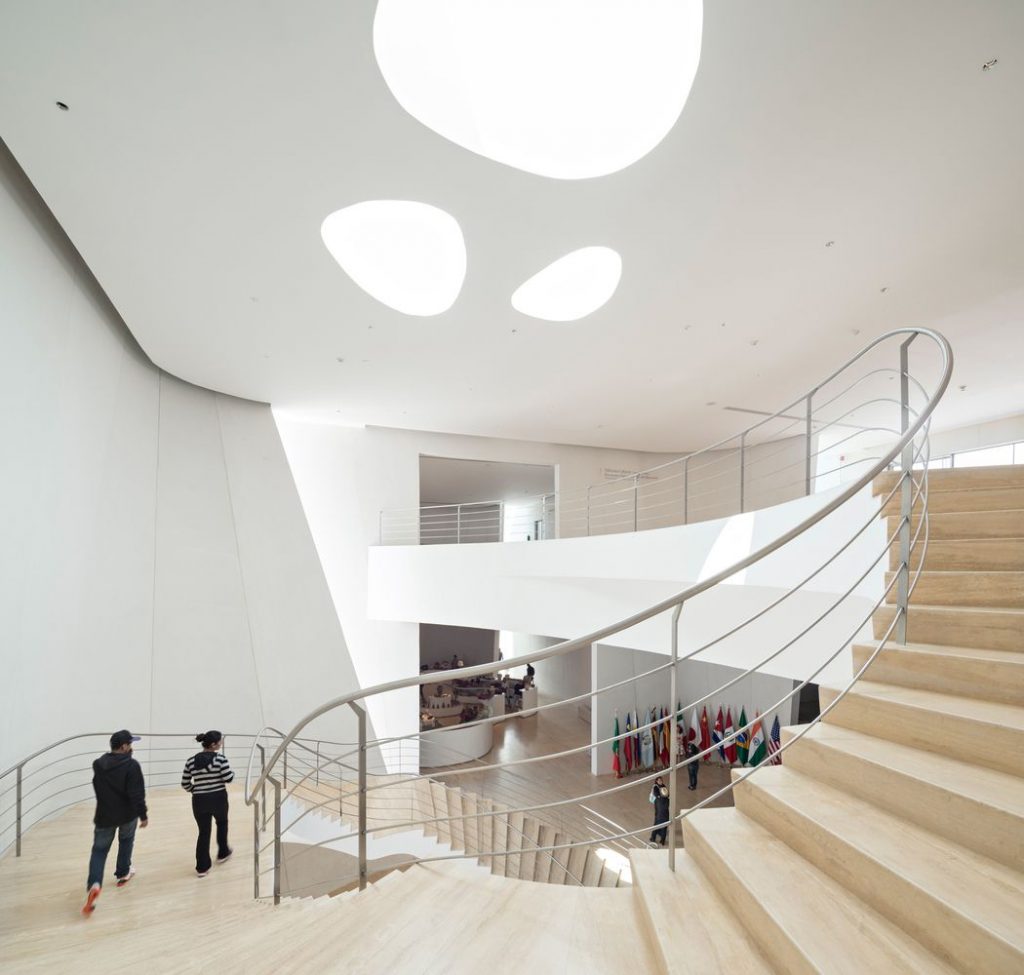
Emphasis was placed on ensuring a natural flow of light because “in Baroque art, light symbolizes a revelation from god opposing the darkness of ambivalence” declared the design team.
“Visitors can experience the light that literally falls from the sky, as if a dialogue between man and nature is taking place.”
CONTRAST
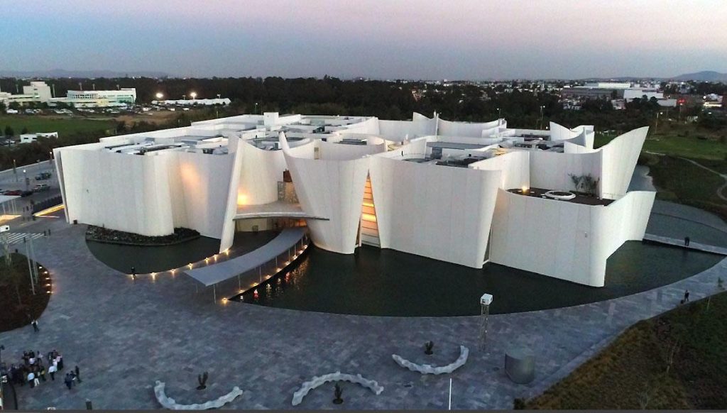
In my opinion the museum fits very well with the environment. Fluted slabs white concrete finish forms the walls, while a crescent-shaped pond wraps the building, intended to create a visual connection with the park. The project focuses on the relationship between man and nature in all aspects of design.
COLOR
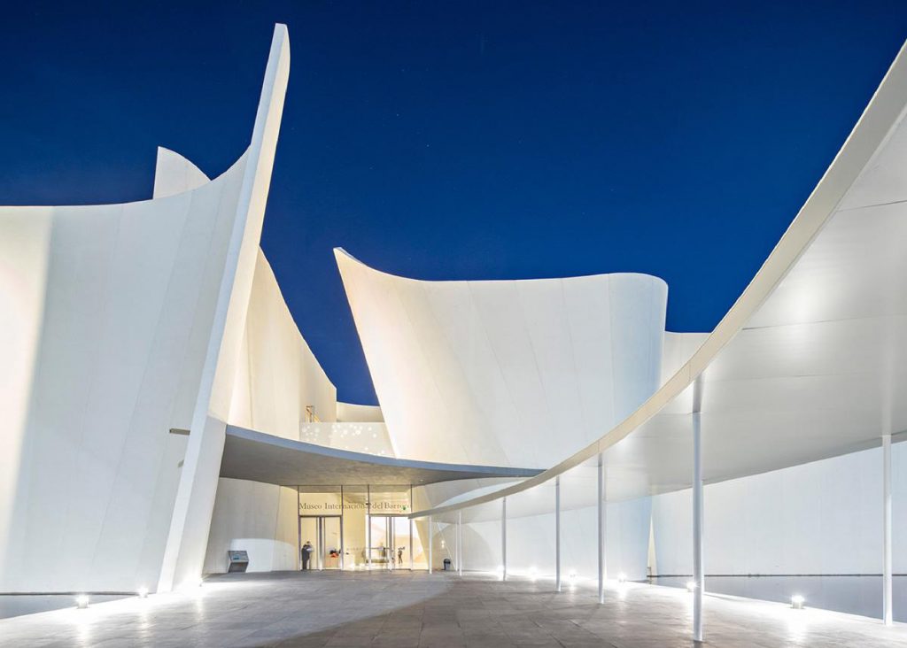
All museum is white. And white was the dominant color of architectural interiors in the Baroque period.
TEXTURE
The exposed concrete has a bush-hammered texture, making it easy to rectify any defects to the finishes on site.
